Cataplisms — a cheeky identity system for an editorial initiative with a unique feline point of view
Branding × Lettering × Illustration
Cataplisms was a project by Dark ‘n’ Light, an online magazine that explored science, nature, social justice and culture, through the arts and humanities. Curated by Cara Tejpal, Cataplisms was born at the intersection of cats and capitalism to explore our increasingly fraught world through a feline lens.
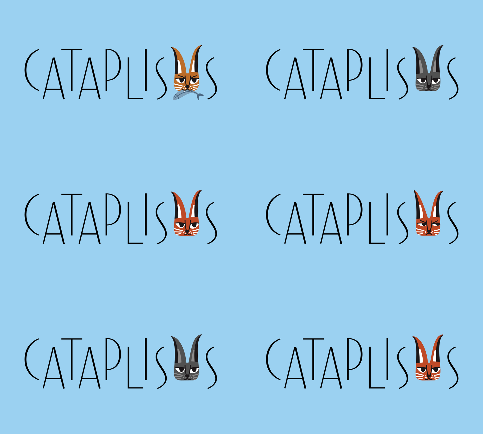
I designed a cheeky identity scheme that pairs playful Art Deco inspired lettering with a suite of cat illustrations that complement the different themes explored through this effort. The goal was to create a visual interpretation which was witty and mischievous, but didn’t resort to stereotypical, pop culture portrayal of cats. The caracal, recognisable by its large tufted ears, provided inspiration for the Cataplisms cat. The lettering struck a fine balance between elegant and light-hearted, and created a canvas for the illustrations to shine. In addition to the primary logotype, I also lettered the titles for two sub-brands under Capitalisms: Cat Fight, pairs of essays that set up debate, and Herding Cats, a series of thematic short films.
