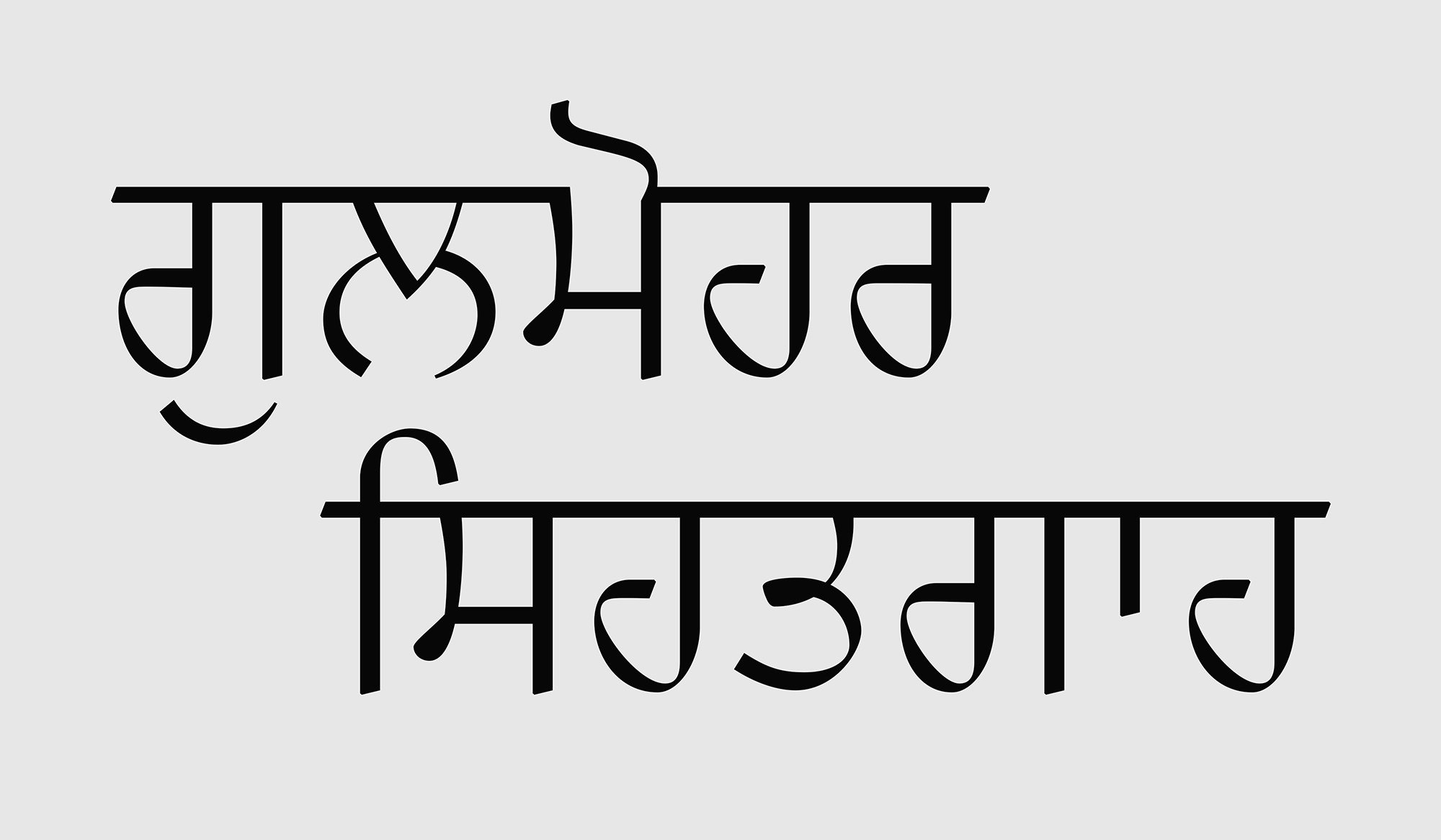
Gulmohar Healthcare — biscriptual logotype in Devanagari and Gurmukhi that balances calligraphy and construction
Lettering × Branding
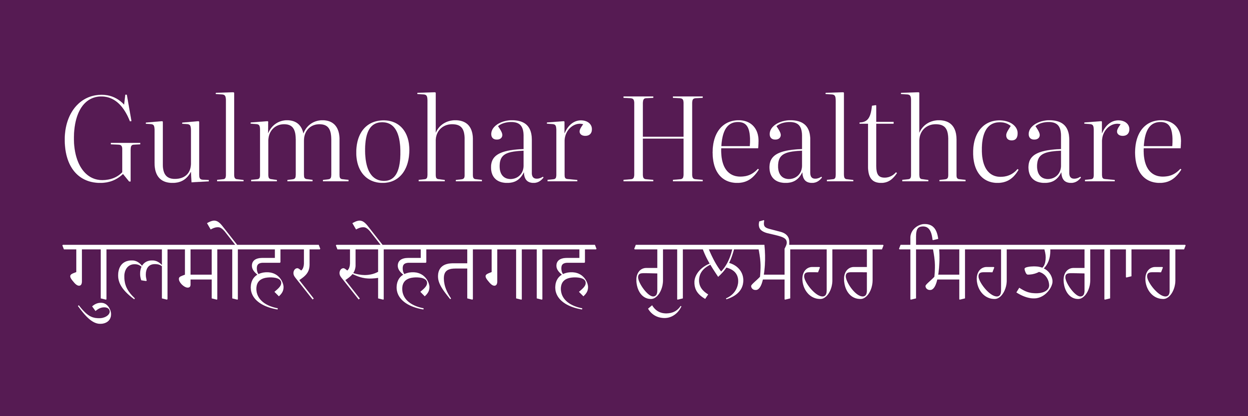
Gulmohar Healthcare is a neighbourhood clinic in New Delhi with a history dating back fifty years. For a branding refresh, they chose Veronika Burian and José Scaglione’s award-winning Literata (I assisted on the typeface’s latest design overhaul) for the Latin logotype, and to address the clinic’s Hindi and Punjabi speaking patients, I designed custom Devanagari and Gurmukhi counterparts to complement it.
With the clients, it was decided that the combined wordmark will feature English (in the Latin script) as primary, with Hindi (in Devanagari) and Punjabi (in Gurmukhi) as equal seconds. Consequently, the weight of the Devanagari and Gurmukhi lettering was matched to the Latin, keeping in mind their differing sizes. The client also requested that the Hindi and Punjabi logos weren’t transliterations, rather translations.
The Indic lettering reimagined the tempered traditionality of the Latin logotype by building on a foundation of calligraphy and refining it through constructed details and proportions. The Devanagari and Gurmukhi letterforms have high contrast, generous counters and even letter widths. Because these two North Indian scripts can appear similar, thoughtful consideration was given to differentiate the two, notably by using contrasting angles of stress, which are grounded in their respective histories and were made conspicuous in the design of knots.