Patrango — rugged and playful Gujarati lettering for the masthead of a children’s magazine
Lettering
Patrango is a biannual Gujarati children’s magazine focused on nature-based storytelling and published by Khojbeen Mandali.
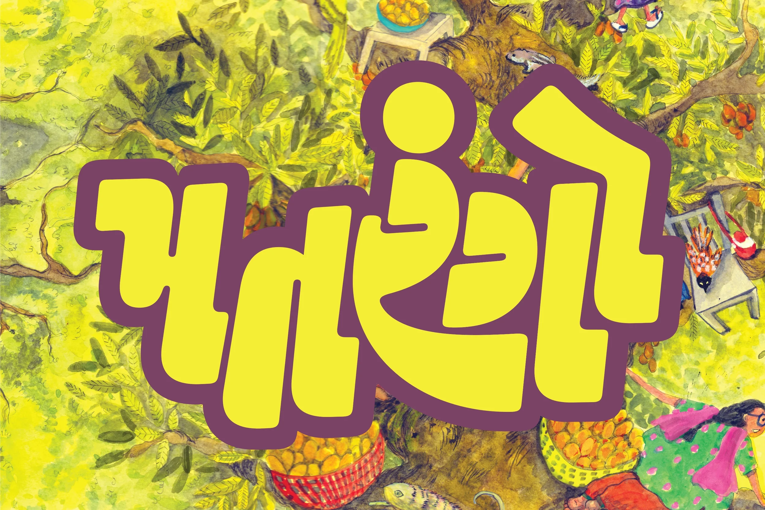
I worked with Mihir Pathak and Bansi Sharma to conceptualise and execute the masthead for this new publication. Together, we zeroed in on burly and energetic visual language that stepped away from formality and convention in typography. There was swift commitment to the idea of the letters interlocking with each other to create a compact unit, but we had to work through multiple iterations to strike the perfect balance between abstraction and simplification of letterforms on the one hand, and legibility on the other; the latter being especially important since the masthead had to be easily read by young children. To ensure legibility, we emphasised in- and out-strokes that are the cornerstone of Gujarati letters, and subtly reinforced the archetypal shapes of letters like ર and ગ to aid in recognition.
The graphic above uses an illustration by Shubhshree Mathur, which features on the cover of Patrango’s inaugural issue.