I SPY WITH MY TYPOGRAPHIC EYE
Issue № 6 / Rupee, Anna, Paisa, Pie
Greetings on a sunny February afternoon! I spy with my typographic eye coins from British India, and on them, the designs of Albert Pearson Spencer. With that, a little peek into Rezwan Razack’s book One Rupee One Hundred Years 1917–2017.
The start of the year has been a busy one for me: wrapping up the design of a book I’ve been involved with since last year; my work at TypeTogether as we gather pace to complete our project documenting primary school handwriting education in the Latin script; and most satisfying of all, weekly workshops with the folks at 3 Sided Coin, whom I’ve been helping build skills in Devanagari type selection and typography.
With everything that was going on, I almost didn’t send the newsletter out this month. Then early in February, I needed a palette cleanser for my grey cells, and I ended up gathering my thoughts enough to write this up and hit send.
Inheriting a coin collection
A couple of summers ago, my Dad gave me a small plastic box. This box contained 50–60 odd coins, survivors from a collection that was started by his maternal grandparents, and nurtured over the years by him and his parents, my Baba and Dadi. A lot of it has been waylaid in the decades since, and I’m told what I have inherited is a fraction. Nevertheless, it has kindled in me an amateur interest in numismatics. I’ve learned a little along the way, of course nothing that a keen or experienced coin collector won’t know. And yet it has been an absolute thrill.

When I first got the box, I emptied its contents, making small stacks of coins from different countries, ones which I could not read at all, others that I knew a little bit about. Most coins were from British and independent India. The rest from elsewhere: Japan, the Soviet Union, Singapore, Nepal, Pakistan, Saudi Arabia, Tunisia, British East Africa (present-day Kenya and Somalia) and Germany. It is obviously the deceit of someone living today, but I cannot fathom how my family collected coins from places so far away well over half a century ago. The foreign coins are all usually from the late 1940s to the 1960s, barring a few exceptions like the Singaporean ones from the 1990s, which most likely my Dad brought back from work trips there. Like a spark bird, some of them have led me down rabbit holes. The 1948 half shilling coin from British East Africa got me learning more about the colonisation of Africa by Western European countries at the cusp of the twentieth century, for example.
Unsurprisingly, the Indian coins have me hooked, even when information about them has been scarce or difficult to find for a newbie like me. I suspect you’ll hear about coins in this newsletter more than once, but let me start today with the British Indian ones I have. Who would have thought that fewer than twenty coins could give me so much to talk about?
The 1914 Pie
At first, I was fascinated by the oldest coin in the collection: a small one with a diameter of just a hair over 17mm. It is from 1914, made of bronze and of denomination one-twelfth anna. Between 1835 and 1957, one rupee in British and independent India was divided into 16 annas. Each anna, in turn, was equal to 4 paise or pice, and a paisa was further divided into 3 pies. One-twelfth of an anna, therefore, would mean one pie, or 192nd of a rupee, if you’d like.

The coin has a bust of George V on the obverse, along with his name and his title (if you’re a regular reader here, you might remember a passing reference to him in the issue about street lettering in Delhi’s Connaught Place). The reverse shows the denomination surrounded by a wreath of oak leaves. It was engraved by Australian sculptor Bertram Mackennal. Mackennal was known for his various depictions of George V in coins, stamps, and even sculptures. In fact, one of his works from 1916 is in the collections of the Rashtrapati Bhawan in Delhi.
The typographic compositions of Albert Pearson Spencer
I’ve been reading about Albert Pearson Spencer, who was the Artist/Engraver at the Calcutta mint between 1926–45. He was responsible for the design (or modification) of several coins of the George VI series, and was behind the coins that I was most drawn to. Among the changes he wrought was to update the style of letters and numerals, replacing the robust letterforms of the past, like on the 1914 coin above, with more elegant ones.
Take, for the example, the 2 anna coin. In previous series, the numeral two appeared with a ball terminal and a thick bracketed serif with the denomination specified under it. Straightforward and functional, but nothing to write home about. Spencer’s designs, which he presented as patterns in 1937, brought about some much-needed flair. The word “ANNAS” was placed horizontally across the numeral two with the latter’s spine gracefully cutting into the word between the letters N and A. The spine of the numeral and the diagonal stroke of A were carefully calibrated so that their angles became compatible.
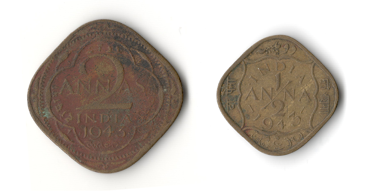
An equally compelling arrangement can be seen in the ½ anna coin that Spencer designed in 1938. The diagonal slash of the fraction bifurcates the the word “ANNA”, and the numerals one and two are placed above and below to complete the design. Instead of being a monolinear stroke, the slash flares at both ends, and is, in my opinion, a thing of real beauty. For this coin, Spencer had the 1908 design for reference. It, too, featured a criss-cross between the fraction and the word, but with a horizontal slash and somewhat cumbersome numerals. He took the same idea and created a much more polished result. A similar approach is in play in the 1 anna coin as well, though it feels less remarkable, what with the simplicity of the form of the numeral.
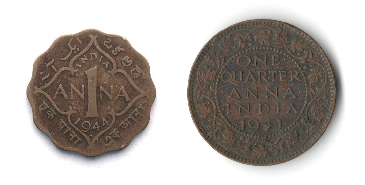
On other coins, such as the ¼ anna, Spencer re-designed the typographic composition in the central panel that presented the denomination in words, while leaving the surrounding details intact. Even though the word “QUARTER” feels a bit cramped here, I find the overall design quite graceful. The centered dots that frame each line of text are not just typographic ornaments. Their number and placement can help one determine where a particular coin was minted.
Languages and Scripts
Empty your pockets and look at the coins issued in India today. They display information in only two languages: English in the Latin script, and Hindi in Devanagari. That has been the case in all the coins that have been issued in indepedent India. The British India coins, on the other hand, showed a bit more imagination. Some like, the older quarter anna are exclusively in English, while others like the two, one and half anna coins include four local languages — Bengali, Hindi, Telugu and Urdu — in four different scripts.
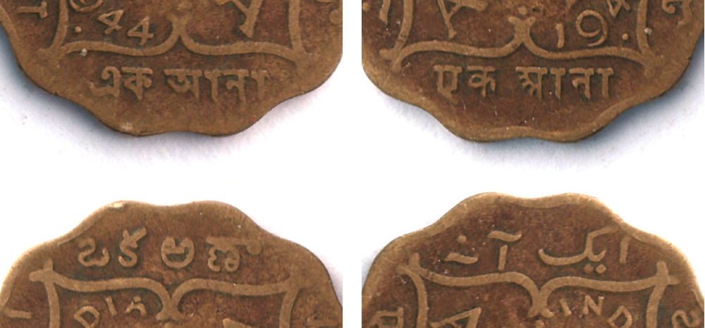
In the top row, Bengali and Devanagari, and in the bottom, Telugu and Urdu, as seen in a 1 anna coin from 1944.
The new pice coin — remember, that’s the same denomination as quarter anna, albeit with a different name — that was introduced in 1943 accommodated Urdu and Hindi alongside English (see a reproduction in the next section) even with a hole in its centre. And although it didn’t make it to production, Spencer had created a version of this coin with four scripts also. Won’t it be incredible if our coins once again showcased a diversity of languages and scripts? It feels improbable in this climate of Hindi imposition, but one can dream.
The 1947 Pice
If the coin from 1914 was an arbitrary beginning to this story, the 1947 pice in the collection is a more logical bookend. 1947, the year India gained independence from the British was the last year that coins of British India were minted. They continued in circulation until 1950 when India became a republic and started producing its own coinage.

This pice coin, which was introduced four years prior, was also designed and engraved by Spencer. The three specimens I have, one each from 1947, 1944 and 1943 were all minted at different locations: at Calcutta, Bombay, and to my surprise, Pretoria (in South Africa), respectively.
One Rupee One Hundred Years 1917–2017 by Rezwan Razack
I visited Rezwan Razack’s Museum of Indian Paper Money in November, where I picked up Razack’s book, One Rupee One Hundred Years 1917–2017. It chronicles the history of the one rupee banknote in India and commemorates the hundredth anniversary of its issue. The book is a trove of information, and with its reproductions of banknotes, an eye-popping exhibition of letterforms.

One Rupee, Government of India (1923–29) Reproduced from One Rupee One Hundred Years 1917–2017.
The first one rupee banknote was issued by the British in 1917 to handle the currency and coinage crisis caused by World War I. I was tickled to learn that the design included printed representations of the silver one rupee coin to imbibe these new banknotes, which weren’t even accepted at par when they were issued, with some familiarity and trust. Notes of this denomination were later issued in other colonial enclaves in the country, by the French and Portuguese, for example; by princely states like Hyderabad and Jammu & Kashmir; and even as coupons in camps for prisoners of wars.

Uma Rupia, Banco Nacional Ultramarino (1924). Reproduced from One Rupee One Hundred Years 1917–2017.
That’s all from me this month. I’ll sign off with a reminder that if you use Devanagari TypeCooker for your drawing exercises, I’d love to see what you come up with and hear your feedback about the prompts. Nikhil Biniwale recently shared some of his drawings on Instagram. Now I might be biased, but he got some pretty interesting results.

.jpg(1919).jpg)