I SPY WITH MY TYPOGRAPHIC EYE
Issue № 2 / When Three isn’t a Crowd
Greetings! This month, I spy with my typographic eye a conversation about multi-script lettering. I’m excited to share a short case study of a project I worked on this year, drawing custom Devanagari and Gurmukhi logotypes for a local business. And for a visual treat, scroll all the way down for a small collection of nameplates from Punjabi newspapers.
Working in India, and with local clients who may not have large budgets to support expensive multi-script efforts, I often advise that they utilise their limited resources for high-impact custom lettering. This way they can speak to their audience in the language and mood of their choosing in a recognisable way, while falling back on a dependable typeface for longer texts, even if it is free or commonly used. The project I am sharing with you today is similar, in that the client and I directed our energies to produce a memorable trilingual logo lock-up that would set their brand apart.
Before I launch into into it, a little reminder that if you’re an organisation — big or small — that is looking to expand its branding to Indian scripts, or an agency helping them, please don’t hesitate to get in touch. I’d love to offer some expert guidance, and work with you to make it happen.

Logotypes for Gulmohar Healthcare
One of my favourite projects in 2022 was drawing logotypes for a local medical practice, Gulmohar Healthcare, which is run by my friend, Dr Purneetha Singh, and her father Dr VPS Chawla. Gulmohar Healthcare is, as they say, the new and improved avatar of the clinic that Dr Chawla has run for close to fifty years. It has now grown to become home to more doctors, offering comprehensive medical care to families in the neighbourhood it has served for decades.

Devanagari and Gurmukhi logotypes for Gulmohar Healthcare, hot off the presses
The practice has always attracted a number of patients who are more comfortable with Hindi and Punjabi than they are with English, and so with the new name and branding, we wanted to make a very visible commitment to these patients by inviting them in the language(s) they prefer. This promise translated not only into multilingual branding, but in the name itself. In Hindi and Punjabi, it does not use transliterations of the word “healthcare”, rather the word is replaced by सेहतगाह and ਸਿਹਤਹਾਹ (sehatagāha) respectively, which loosely translate to sanatorium.
The checklist
I am always excited by the novelty of challenges that custom lettering jobs bring, and this one was no different.
Purneetha and I knew that accommodating three languages in three scripts on one somewhat small signboard (there was only space to go 8 feet wide and 2 feet tall) was going to be tricky, especially when the name needed to be readable, and stand out in the busy visual landscape of the marketplace where the practice is located. That’s why early on we decided that the English name (in the Latin script) would take the primary spot, and the Hindi (in Devanagari) and Punjabi (in Gurmukhi) would be equal seconds. Visually, this meant that the Hindi and Punjabi logotypes would sit together below the English one — thank god for no descenders — and their relative size would be established based on this composition.
The English logotype for Gulmohar Healthcare came pretty much pre-baked. It uses a light, display weight of TypeTogether’s Literata, the typeface that was used in the branding for the practice before it was rechristened. Consequently, the Hindi and Punjabi logotypes had to be designed to work well with it in close quarters.
Finally, all three logotypes had to appear to carry similar weight despite the difference in scale that the lock-up necessitated.

The signboard for Gulmohar Healthcare with its trilingual branding
Pairing with Latin
I have long found the idea of “matching” scripts a fraught one. The more I draw letters, the more I feel that instead of “matching”, I want, when I can, to focus on making different scripts look “complementary” when they appear together. It is naive, if not facetious, to believe that two scripts will always be tonally similar when they are presented in styles that are visually alike. More so, when one script depends on a long well-documented typographic history and decades of design rhetoric to establish semantics (usually, Latin), and the other (say any script from India) hasn’t enjoyed similar attention, study or discourse.
In this project, the starting point was the Latin design of Literata. While Literata grew from Scotch Roman and old style underpinnings, it is not a typeface family with strong historical fixedness. It borrows functional aspects of designs from another era, and reinterprets them to solve today’s typographic problems. The first step for me was to look at its letterforms from that perspective, rather than through the rigid lens of design and art periods and the meanings we associate with their formal features now. This, I believe, was made easier by the fact that I had assisted in Literata’s design expansion a few years ago. I see Literata’s letterforms as being pragmatic. They have distinctive but unfussy details. And the typeface has a whiff of being traditional without being old-fashioned. It is these qualities that I tried to bring to the Devanagari and Gurmukhi logotypes.
Devanagari 🤝 Gurmukhi
Seen casually, Devanagari and Gurmukhi can look very alike. They both hang from a headline, have vowels and other marks that attach above and below letters, some letters look similar, and others seem downright identical.
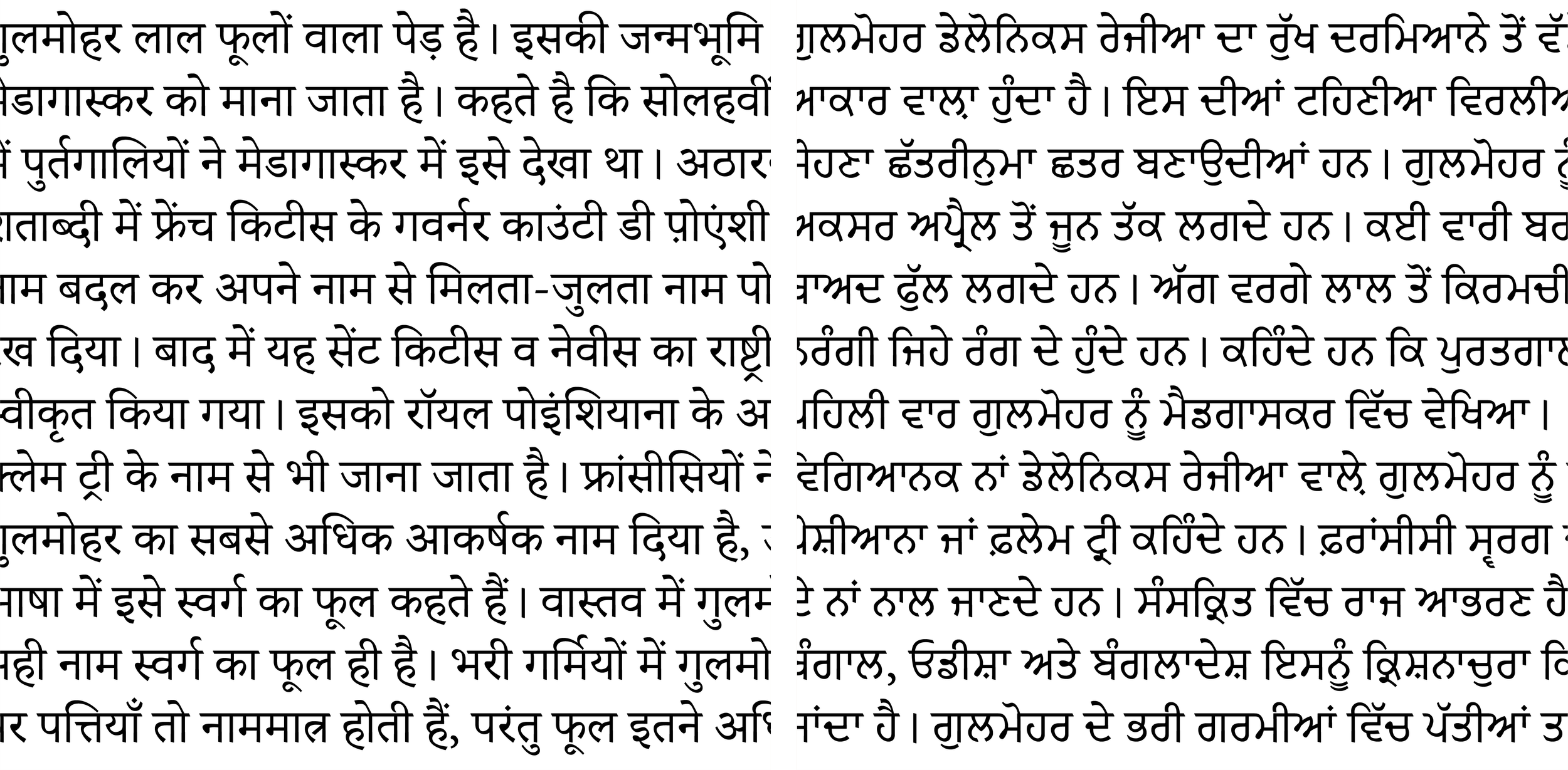
But look more closely, and the differences between them start to become apparent. Take the ग and ਗ for instance. Both letters have two vertical stems with the left one ending in a knot or loop. While in Devanagari, the left vertical stems goes down to only about two-thirds of the height of the letter, in Gurmukhi, it is obviously deeper. The loop in the Gurmukhi ਗ usually creates a sizeable counter, making the letter wider than its Devanagari counterpart, which often features a knot and therefore is narrower. This difference in proportions applies even at a global level, meaning that Gurmukhi usually appears to be horizontally extended and airy in comparison, assuming, of course, that text in both scripts share the same letter height.

Apart from the skeletons of the letterforms, what can make these two scripts look very different is the angle at which the reed pen (real or notional) is held while writing them. Draw the same shape with the pen held at different angles, and the resulting effect can be dramatic; with different shapes, the divergence is even more pronounced. While Gurmukhi can be written using a pen at an angle similar to what is used for Devanagari, it is also written at an angle that is almost the opposite.


Excerpts from Aksharaya: Letter Consious People’s Introductory Manuals to Calligraphy in Devanagari and Gurmukhi
Because the two scripts were being placed in the same line in the lock-up, I felt it was crucial to distinguish between them as much as possible, as opposed to emphasising their similarities to make them look alike.
Bringing it all together
With all of that in mind, I drew the Devanagari and Gurmukhi logotypes to have high contrast, and traditional, albeit different, angles of stress. They have the same height and vertical proportions for vowel signs, and this automatically makes the Gurmukhi a little wider.

I cut the stroke terminals to contemporise the designs, which are built on classical bones. Knots in the Devanagari and Gurmukhi echo the speed of the curves of their counterparts in the Latin, but make no attempt to copy their rounder shapes, sticking to what is more natural in their letter construction. The logotypes also pick up on the noticeable but modest difference in letter widths in Literata. The result is Devanagari and Gurmukhi letters that are crisp and uncluttered, and that, like the Latin letters of Literata, walk the line between the old and the new in an engaging way.


Native, non-native or something in between
This would also be a good place to talk about about my familiarity with and competence in these two scripts. Hindi was the second language I learned in school after English, and Devanagari is the Indic script I am most comfortable with. I can read and write in it with proficiency, and have consumed media in it all my life.
My relationship with Punjabi and Gurmukhi is not as straightforward. Having spent most of my life in and around Delhi, I heard neighbours, friends, and strangers talk in Punjabi all the time, and if they were kind enough to speak just a little slowly, I could understand most of what they were saying. I taught myself the basics of reading it in the Gurmukhi script by squinting my eyes at the multilingual (English, Hindi, Punjabi and Urdu) signs that dot the city, and got pretty good at that by the time I was a high-school student.
A couple of years ago I took Punjabi lessons. While the finer points of grammar and pronunciation may have evaporated from my memory, I am grateful that the muscle memory of writing in Gurmukhi, whether it was taking notes in class or doing homework every day, has stayed. That, along with my dogged attempts to read in Punjabi, has given me a sense of familiarity with these letterforms that I couldn’t have claimed otherwise. Without that familiarity, I can’t imagine I could have embarked on this project with any real confidence.
Gurmukhi newspaper nameplates
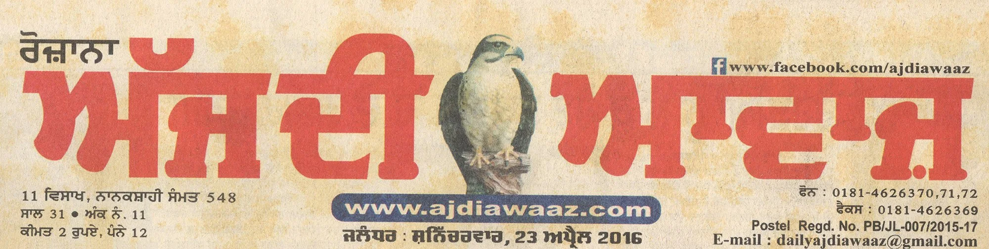
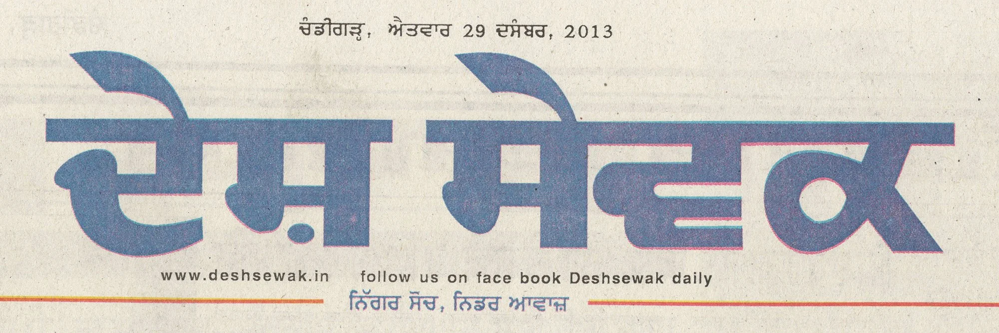
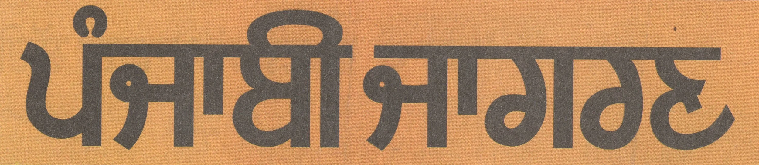
To wrap up this month’s dispatch, I bring you a small collection of newspaper nameplates in Gurmukhi to file away in your inspiration cabinet. From the top — Rozana Spokesman (ਰੋਜ਼ਾਨਾ ਸਪੋਕਸਮੈਨ) with its idiosyncratic diamond-shaped terminals; the high contrast and seriffed letters of Punjabi Tribune (ਪੰਜਾਬੀ ਟ੍ਰਿਬਿਊਨ); yet another seriffed design in Aj di Awaaz (ਅੱਜ ਦੀ ਆਵਾਜ਼), with a photograph of what appears to be a peregrine falcon in place of pride; Desh Sevak (ਦੇਸ਼ ਸੇਵਕ) and Ajeet (ਅਜੀਤ), which have vertical contrast; and finally, the monolinear nameplate of Punjabi Jagran (ਪੰਜਾਬੀ ਜਾਗਰਣ).


P.S. A big thank you to everyone who signed up for this newsletter! To be completely honest, I wasn’t quite expecting the very warm reception it has enjoyed. I hope you’ll share this issue with a friend who might like reading about branding and multi-script lettering, and nudge them to subscribe.
